Understanding how to transform complex data into clear, visual insights that drive smarter business decisions and reveal hidden patterns across your organization.
Data visualization is the graphical representation of information and data. By using visual elements like charts, graphs, and maps, data visualization tools provide an accessible way to see and understand trends, outliers, and patterns in data.
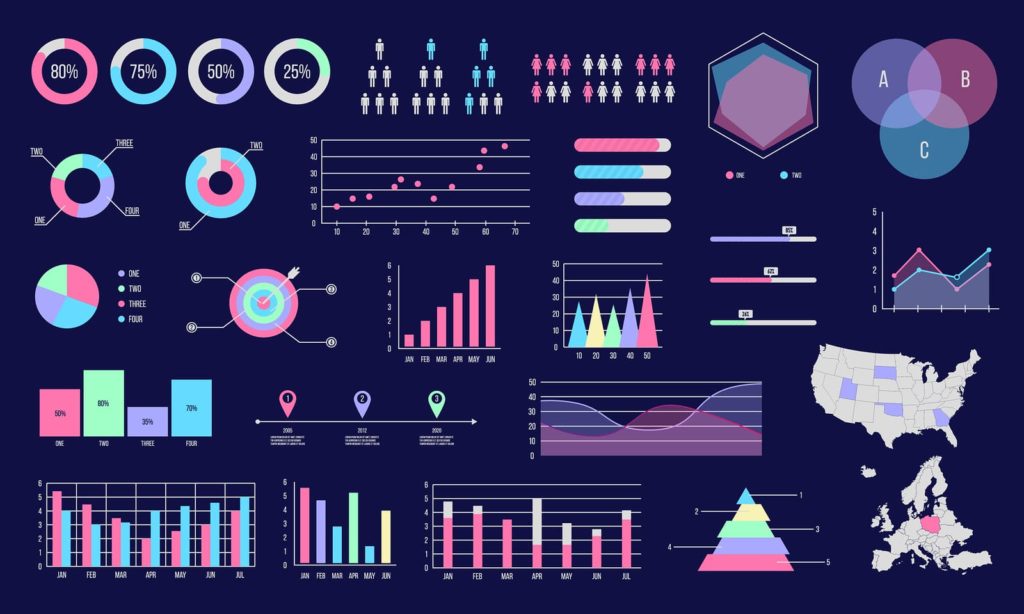
In today’s data-rich world, visualization has become an essential skill for analysts, marketers, executives, and anyone who needs to communicate insights effectively. Modern dashboards combine multiple visual formats — from simple bar charts to interactive heatmaps — to tell compelling data stories.
Whether you’re tracking website performance, analyzing sales trends, or monitoring campaign ROI, data visualization transforms raw numbers into clear, actionable intelligence that drives better decision-making at every level.
Why Visual Data Drives Predictable Growth
Reveals Hidden Patterns Visual formats expose trends and correlations that raw data tables cannot, enabling proactive strategy adjustments.
Accelerates Comprehension Humans process visuals 60,000x faster than text — charts communicate insights instantly to any audience.
Enables Real-Time Monitoring Live dashboards let teams track KPIs in real time, enabling instant responses to changing conditions.
Improves Stakeholder Communication Well-designed visuals make complex data accessible to executives, clients, and cross-functional teams.
How Data Visualization Works
A strategic, step-by-step process that turns raw data into powerful visual insights.
Visualization Process
Collect Raw Data
Gather data from databases, APIs, spreadsheets, and marketing platforms into a centralized repository.
Clean & Organize Data
Remove duplicates, fix inconsistencies, and structure data into formats ready for visual analysis.
Choose Visual Format
Select the right chart type — bar, line, pie, heatmap, or dashboard — based on data type and audience.
Analyze & Interpret Insights
Explore the visualizations to identify trends, outliers, correlations, and actionable patterns.
Share & Act on Findings
Distribute reports and dashboards to stakeholders, then implement data-driven strategies.
Types of Data Visualization
Explore the diverse visualization types available to analyze your data and communicate insights effectively.
Visualization Types
Bar Charts
Compare categories side by side with horizontal or vertical bars, ideal for ranking and distribution analysis.
Line Graphs
Track changes over time with connected data points, perfect for trends, growth, and time-series analysis.
Pie Charts
Show proportional data and part-to-whole relationships in a circular format for quick composition insights.
Heatmaps
Use color intensity to represent data density or magnitude, great for geographic and behavioral data.
Scatter Plots
Plot two variables against each other to reveal correlations, clusters, and outliers in your datasets.
Dashboards
Combine multiple visualization types into a single interactive view for comprehensive real-time monitoring.
Infographics
Blend data visuals with design elements to create engaging, shareable content for broader audiences.
Interactive Visuals
Enable users to filter, drill down, and explore data dynamically for deeper self-service analysis.
Data Visualization Platforms & Tools
The essential platforms and tools every analyst needs to create compelling, data-driven visualizations.
Essential Tools
Tableau
Industry-leading analytics platform for creating interactive, shareable dashboards from any data source.
Power BI
Microsoft's business analytics service providing rich visualizations with self-service BI capabilities.
Looker Studio
Google's free tool for creating customizable, shareable dashboards and visual reports.
Excel / Google Sheets
Accessible spreadsheet tools with built-in charting for quick data visualization and basic analysis.
Chart.js / D3.js
Open-source JavaScript libraries for building custom, interactive visualizations on the web.
Qlik Sense
AI-powered analytics platform with associative data modeling and smart visual discovery.
Zoho Analytics
Self-service BI platform with drag-and-drop report creation and embedded analytics.
Microsoft PowerPoint
Presentation software with data visualization capabilities for executive-ready chart presentations.
Why Data Visualization Matters
Data visualization is a critical investment that delivers tangible results across every stage of your analytics journey.
Key Benefits
Easier data interpretation for all team members
Spot trends quickly before competitors do
Improved reporting with clear visual summaries
Data-driven decision making at every level
Better team communication through shared dashboards
Related Data Visualization Articles
Stay updated with the latest data visualization insights, strategies, and best practices.